
Why Your Website Is Secretly Sabotaging Your Business (And How to Fix It)
Here's a fun fact that'll ruin your day: 53% of mobile users abandon sites that take over 3 seconds to load.
Still think that fancy animation on your homepage is worth it?
Looking at the UK business website landscape, we've noticed a pattern: Most of them are digital disasters. Not because they're ugly (though some definitely are), but because they're built backwards – focusing on what the business wants to say rather than what visitors need to find.
Time for some tough love about your website.
The Brutal Truth: Your Website Isn't About You
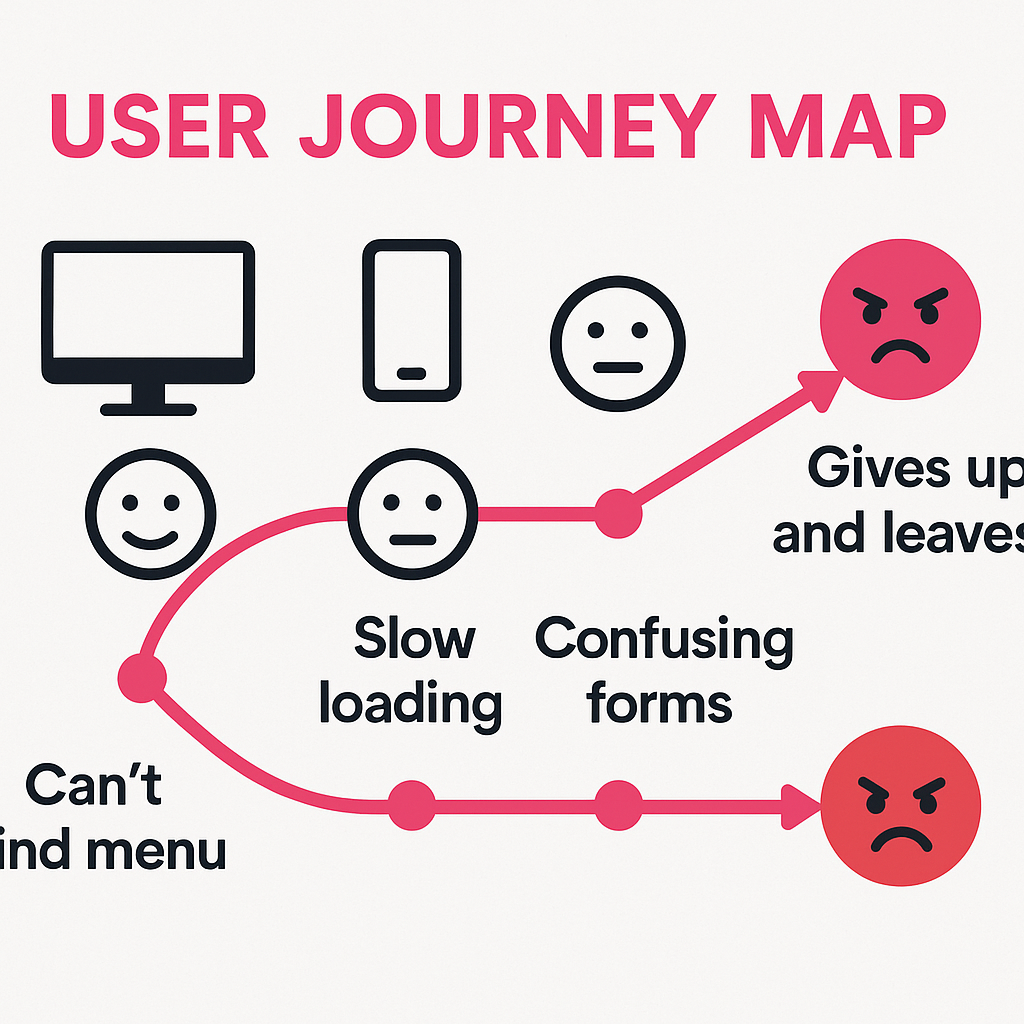 This is what your visitors actually experience
We know you love your company history page. That timeline showing your journey from 1987 to now? Beautiful. That photo of your office building? Lovely.
But here's the thing: Nobody cares.
Your visitors have problems. They're looking for solutions. And if your website doesn't immediately show them you can help, they're gone faster than free cake at an office party.
The 5 Deadly Sins of Modern Web Design
1. The "Where's Wally" Navigation
You know what we're talking about. Mysterious menu items like "Solutions" or "Resources" that could mean literally anything. Or worse – those hamburger menus on desktop sites.
The Fix: Use clear, descriptive labels. "Google Ads Management" beats "Services" every time. Your nan should be able to find what she needs without a map.
2. The Wall of Text Homepage
We get it – you've got lots to say. But your homepage isn't your autobiography. It's more like speed dating. You've got seconds to make an impression.
The Fix:
- Lead with a clear value proposition
- Use bullet points for key benefits
- Break up text with relevant images
- Include ONE clear call-to-action above the fold
3. The Mobile Afterthought
"It looks great on desktop!" isn't the flex you think it is when 60% of your traffic is thumbing through on their phones during their commute.
 Design for mobile first, desktop second
The Fix: Design mobile-first. If it works brilliantly on a phone, it'll work everywhere. Test on actual devices, not just your browser's mobile view.
4. The Stock Photo Syndrome
Nothing says "we're totally real and trustworthy" like that same stock photo of smiling businesspeople in suits that's on 47,000 other websites.
The Fix: Use real photos of your actual team, office, or work. Can't afford a photographer? Modern smartphones take brilliant photos. Authenticity beats polish every time.
5. The Conversion Prevention Kit
Contact forms with 27 fields. Hidden phone numbers. "Get a quote" buttons that lead to... another form. It's like you're actively trying to stop people from becoming customers.
The Fix:
- Maximum 5 fields on forms (name, email, phone, and maybe one relevant question)
- Phone number in the header – clickable on mobile
- Live chat for instant questions
- Clear, specific CTAs: "Get Your Free Website Audit" not "Submit"
The Modern Web Design Principles That Actually Matter
Speed Is Everything
If your site takes more than 3 seconds to load, you're losing money. Every. Single. Day.
Quick wins:
- Compress those massive images (no, your hero image doesn't need to be 5MB)
- Use lazy loading for images below the fold
- Minify CSS and JavaScript
- Get better hosting (yes, it matters)
Clarity Beats Cleverness
That innovative navigation where users have to hover over abstract shapes to reveal menu items? Stop it. Just stop.
Good design is invisible. When users can find what they need without thinking, you've won.
Trust Signals Are Non-Negotiable
In 2026, visitors decide if they trust you in under 50 milliseconds. You need:
- SSL certificate (the padlock in the address bar)
- Clear contact information
- Real testimonials with full names and photos
- Industry certifications or awards
- Privacy policy and GDPR compliance
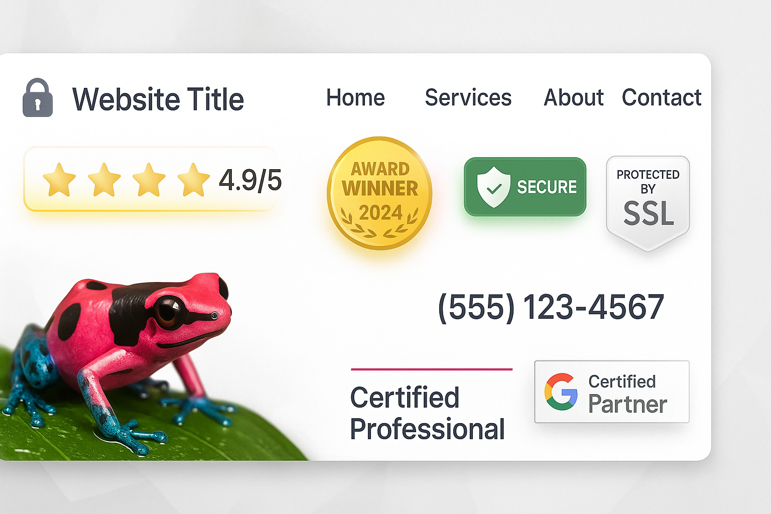 Trust signals that actually work
Accessibility Isn't Optional
15% of the world's population has some form of disability. That's over 1 billion potential customers you're ignoring if your site isn't accessible.
Plus, accessible design is just good design:
- Clear contrast between text and background
- Descriptive alt text for images
- Keyboard navigation
- Clear, readable fonts (minimum 16px for body text)
The Pink Frog Approach to Web Design
Our philosophy is to design websites backwards – starting with what happens AFTER someone lands on your site.
- What do they need? (Not what you want to tell them)
- What action should they take? (Be specific)
- What might stop them? (Remove every obstacle)
- How do we prove we can help? (Show, don't tell)
Then we build a site that guides them smoothly from problem to solution.
Your Website Audit Checklist
Run through this right now:
☐ Load time under 3 seconds? (Test at GTmetrix.com) ☐ Clear value proposition in first 5 seconds? ☐ Mobile responsive? (Check on actual phones) ☐ Contact info visible on every page? ☐ Forms under 5 fields? ☐ Real photos, not stock? ☐ SSL certificate active? ☐ Clear, descriptive navigation? ☐ Testimonials with real names? ☐ One clear CTA per page?
Score less than 8/10? Your website is costing you money.
The Bottom Line
Your website isn't a brochure. It's not a monument to your achievements. It's a tool that should be working 24/7 to grow your business.
If it's not generating leads, building trust, and converting visitors into customers, it's just an expensive digital decoration.
Ready to turn your website from a liability into your best salesperson?
P.S. That company history page we mocked earlier? It's actually important – just not on your homepage. Tuck it away in the footer where the people who really want it can find it.
Need a website that actually works? Let's talk – we promise to be honest about what needs fixing.
Ready to Grow Your Business?
Get a free Google Ads audit and discover untapped opportunities to increase your ROI.
Get Your Free Report →Written by Pink Frog Studio
Digital Marketing Specialist
With over 5 years of experience in digital marketing, Pink helps UK businesses unlock their online potential through data-driven strategies and proven tactics that deliver measurable results.
Continue Learning
Explore more insights to grow your business

What Is Google PageSpeed and Why Does It Matter for Your Business?
Your website's speed is costing you money. Learn what Google PageSpeed really measures, why it affects your rankings and conversions, and see a real case study showing a 47 to 93 score transformation.

Why We Ditched WordPress for Next.js (And Your Business Should Too)
WordPress powers 40% of the web. It's also holding 40% of businesses back. Discover why modern frameworks are leaving WordPress in the digital dust.

The Real Story Behind Pink Frog Studio (Starring the Lipstick False Dart Frog)
Meet the Lipstick False Dart Frog – the stunning pink and black amphibian that inspired our agency name and embodies everything we stand for.
Ready to Grow Your Business?
Let's have a quick chat about how we can help you get more customers.