
5 Things on Your Homepage That Quietly Lose You Customers
Most homepages don't fail loudly. They don't crash or look obviously broken. They fail quietly — a visitor lands, something doesn't quite click, and they tap back to Google and ring the next firm on the list. You never see it happen. There's no error message that says "you just lost a customer".
Over the years we've looked at a lot of local business homepages around Exeter and Devon, and the same small leaks turn up again and again. None of them are dramatic. All of them are fixable. Here are the five worst offenders.
1. It's not instantly clear what you do — or where
You know what your business does. The stranger who just landed on your homepage does not. And they'll give you about two seconds before deciding whether to stay.
The classic mistake is a big, pretty hero image with a vague slogan over it — "Quality you can trust" or "Welcome to our website". Lovely. But it tells me nothing.
The fix: say what you do and where you do it, plainly, at the very top. "Boiler repairs and bathroom fitting across Exeter and East Devon." A café? "Independent coffee and brunch in the heart of Topsham." It's not glamorous. It works.
2. The way to contact you is hidden
This one's so common it's almost a rule. The phone number is tucked into a header in tiny grey text, or buried right at the bottom, or — worst of all on a mobile — it's there but it isn't tappable, so the customer has to memorise it, swap apps, and type it in. Most won't bother.
The fix: make your phone number obvious and tappable on every page, ideally near the top. On mobile, a "Call now" button that triggers a dial is gold. If you take enquiries by form, the form should be easy to find without scrolling forever.
3. It's slow
Speed is the silent killer. Over half of mobile visitors abandon a page that takes more than three seconds to load — and a lot of small-business sites are dragging around enormous uncompressed photos, a heavy template stuffed with features you don't use, and a pile of plugins.
The cruel part is you won't notice, because your own browser has the site cached and loads it fast. Your customers, arriving cold on a phone with patchy signal, get a very different experience.
The fix: test your site on Google's free PageSpeed Insights. If it's poor, the usual culprits are oversized images and an overloaded theme. Sorting those out is one of the highest-value, lowest-glamour jobs there is.
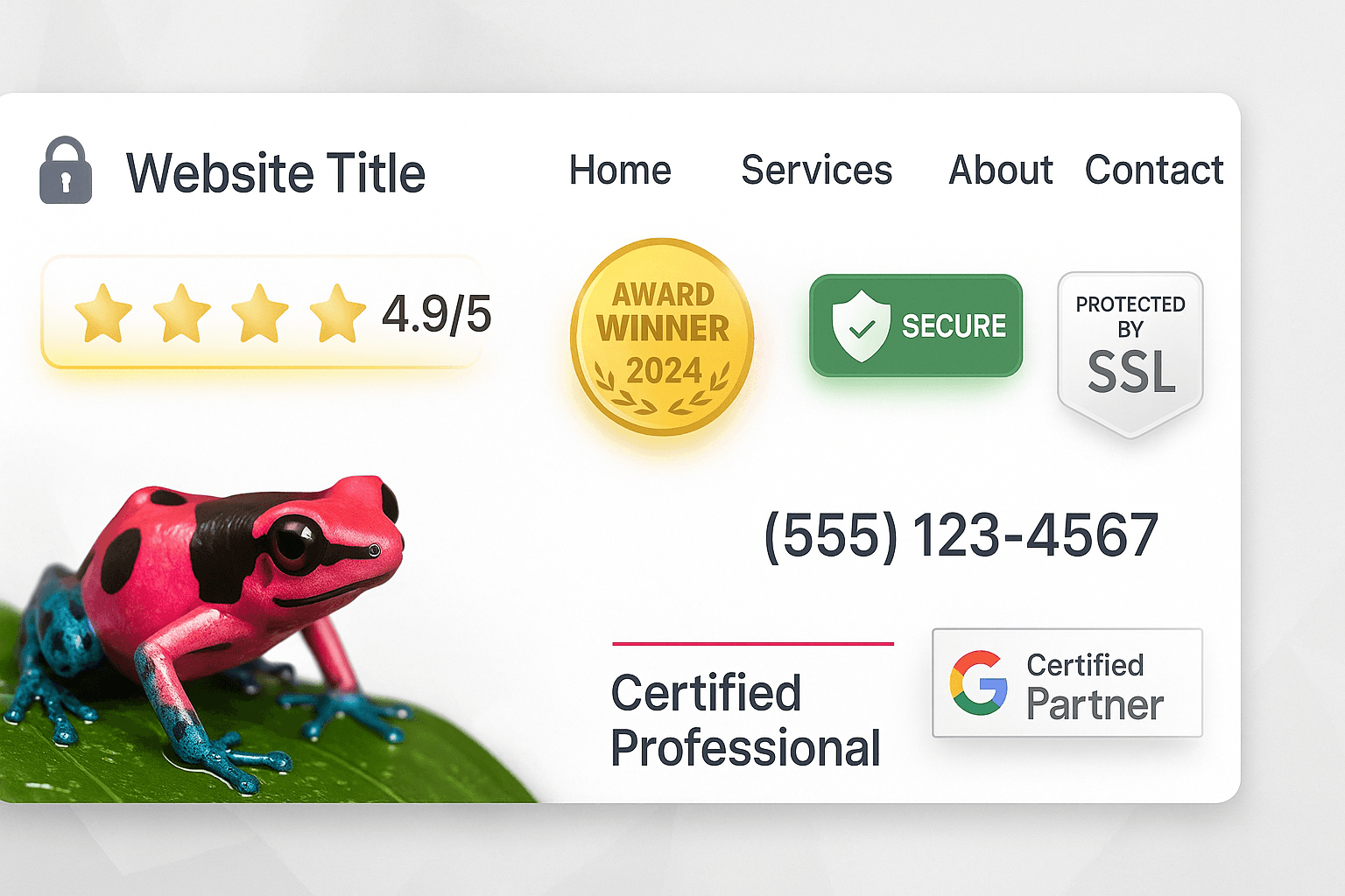
4. There's no reason to trust you
A homepage that's all "we" and no proof asks the visitor to take you on faith. Strangers don't ring strangers. They ring businesses that feel proven by other people.
If there's no sign of real reviews, no photos of actual work or the actual premises, no friendly face, no local connection — there's nothing for a nervous first-time customer to grab onto.
The fix: put your trust signals where people can see them. A line of recent Google reviews. Real photos — your team, a finished job, the inside of the café. "Serving Exeter since 2011." A logo or two of suppliers or trade bodies if you've got them. These small reassurances do a lot of quiet heavy lifting.
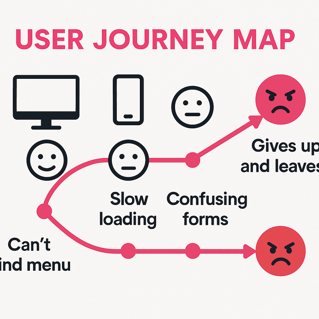
5. You're asking people to think too hard
A homepage that offers ten equally-sized buttons, three different phone numbers, two forms and a wall of text isn't giving the visitor freedom — it's giving them a decision they didn't want to make. Confused people don't act. They leave.
The fix: decide the single most important thing you want a visitor to do — usually call, or fill in a form — and make that the obvious next step. Everything else on the page should support that one action, not compete with it. One clear "next step" beats five blurry ones every time.
The pattern behind all five
Notice they're all the same thing, really: make it effortless for a busy person to understand you, trust you, and contact you. That's the whole job of a homepage for a local business. Looking nice helps, but only in service of that.
Spend an afternoon going through these five with a critical eye — ideally on your phone, pretending you've never seen the site before. You'll almost certainly find at least one leak. Plugging it costs you nothing and could be worth a lot of phone calls.
And if you'd like a second pair of eyes, that's the sort of thing we do every week for Devon businesses. Send us your website and we'll give you an honest rundown of what's working and what's quietly costing you — no jargon, no hard sell.
Ready to Grow Your Business?
Get a free Google Ads audit and discover untapped opportunities to increase your ROI.
Get Your Free Report →Written by Pink Frog Studio
Digital Marketing Specialist
With over 5 years of experience in digital marketing, Pink helps UK businesses unlock their online potential through data-driven strategies and proven tactics that deliver measurable results.
Continue Learning
Explore more insights to grow your business
Your Website's Job Is to Get the Phone to Ring. Here's How to Tell If It's Doing It.
Forget pretty for a minute. A small-business website has one job — turn visitors into enquiries. Here's how to check whether yours is actually earning its keep, using tools you already have.
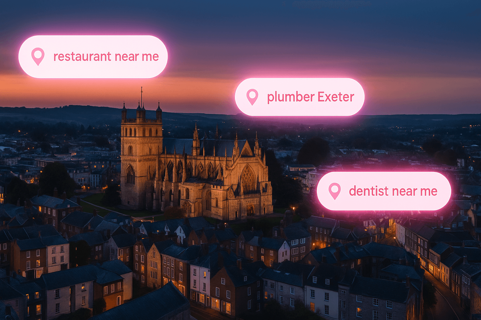
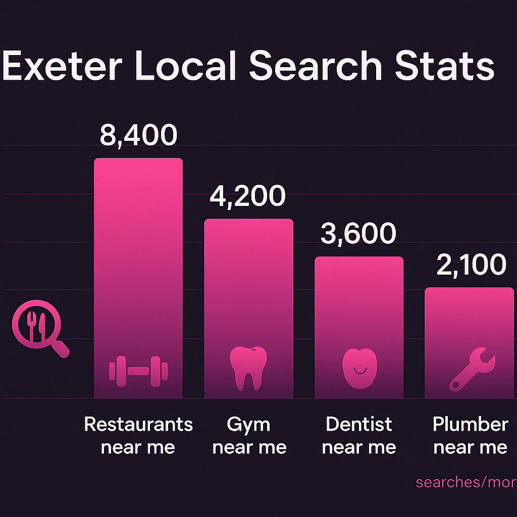
How to Actually Show Up When Someone Googles a Plumber Near Them
Local SEO in plain English. No jargon, no smoke and mirrors — just the handful of things that decide whether a Devon customer finds you or the firm down the road when they reach for their phone.
Google Business Profile: The Free 20 Minutes That Beats Most Paid Ads
For a local business, the single highest-value marketing job costs nothing and takes about twenty minutes. Here's exactly how to set up and tune your Google Business Profile so it works for you.
Ready to Grow Your Business?
Let's have a quick chat about how we can help you get more customers.